Kanopy

Objective
When Kanopy came to us to shape their brand and website, we felt an instant resonance. Their work—anchored in care, precision, and the quiet courage it takes to heal—called for a presence that felt both clinical and deeply human. For us, this project reaffirmed how abstract visual language, when held with intention, can communicate emotional resonance that words alone cannot.
Services
brand identity
web design
strategy
consulting
gentleness, integrity, and reverence for the journey within


Every element—from language to layout—was approached with purpose and care. The final site embodies what Kanopy stands for: clarity, compassion, and a reverence for transformation.
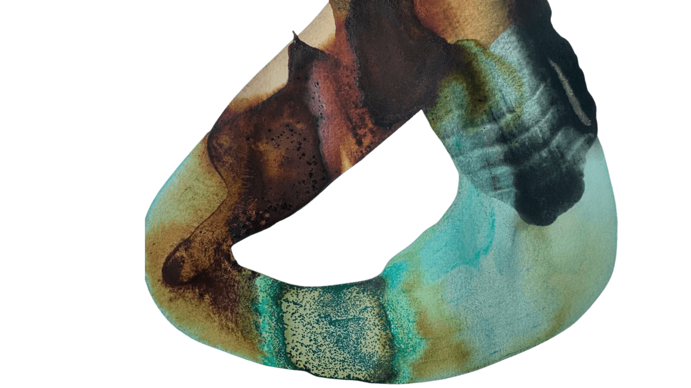
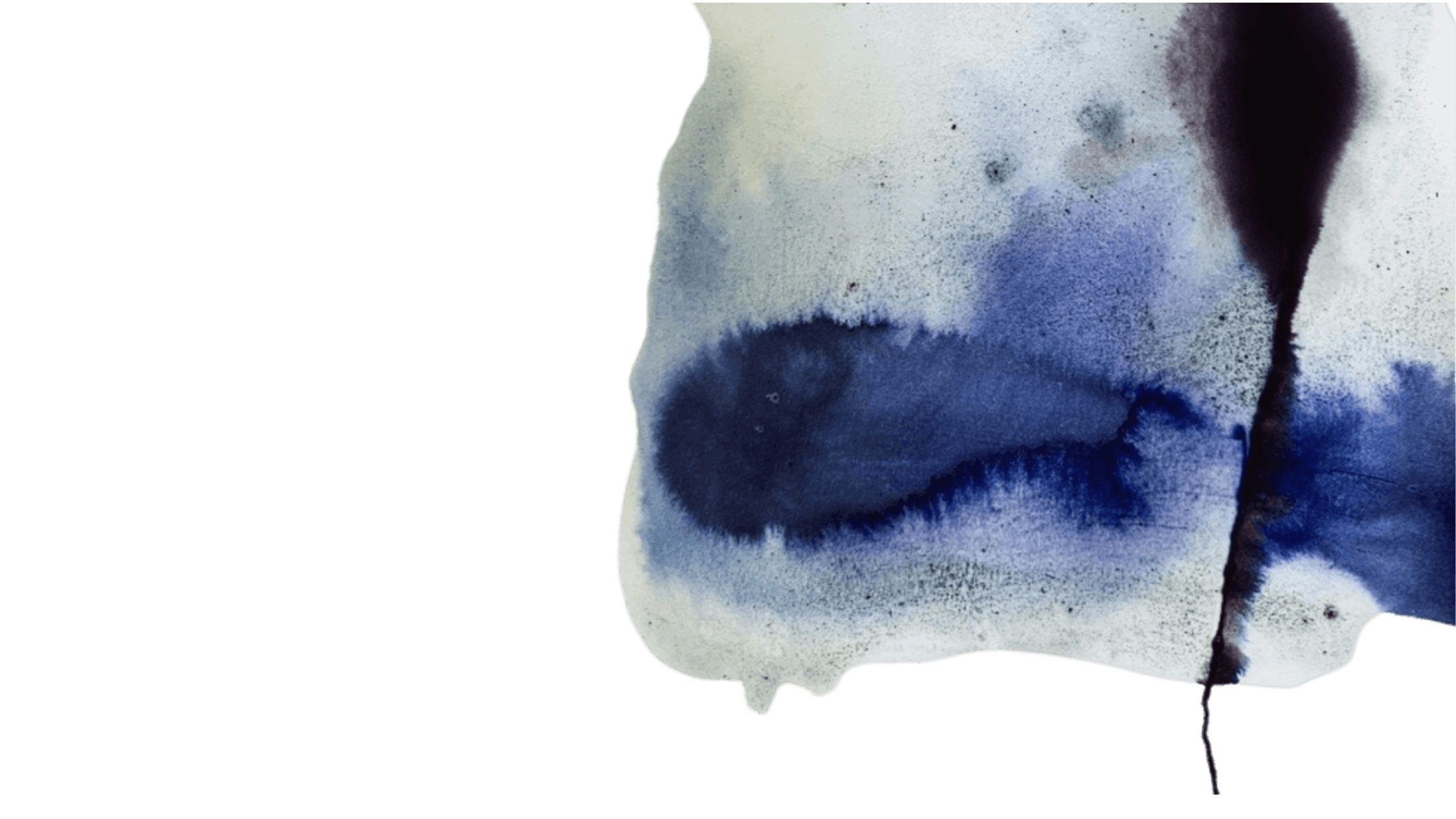
We wove nature-inspired abstract artwork throughout the design to mirror the expansiveness of their work and paired with a balancing, clean and minimal structure that conveys trust and calm.
The result is a grounded digital space that feels both and contained, allowing the full depth of their healing experience to unfold.
The work is not about forcing experience, but offering safety: a holding container in which emergence, release, insight, and integration can unfold.


The live site became a mirror for Kanopy’s own internal ethos: clear, spacious, caring, and expansive.
It allowed future clients to feel a sense of safety and curiosity even before stepping foot in their physical space.

Kind Words
“We love the website and are so grateful for all of the time you spent working with us to make it perfect”
Kanopy